Design Kit
Welcome to Nuxt design definition page. Identity was redefined by handpicking conscientiously colors, typography and shapes in order to put forward how performant, useful & easy Nuxt products are.
Download design kitColors
Nuxt brand colors
Our main palette is comprised of a strong inspiring gradient, white, and dark gray to bring sobriety to our brand and is used in logical ways throughout marketing to guide the eye and highlight the important bits.
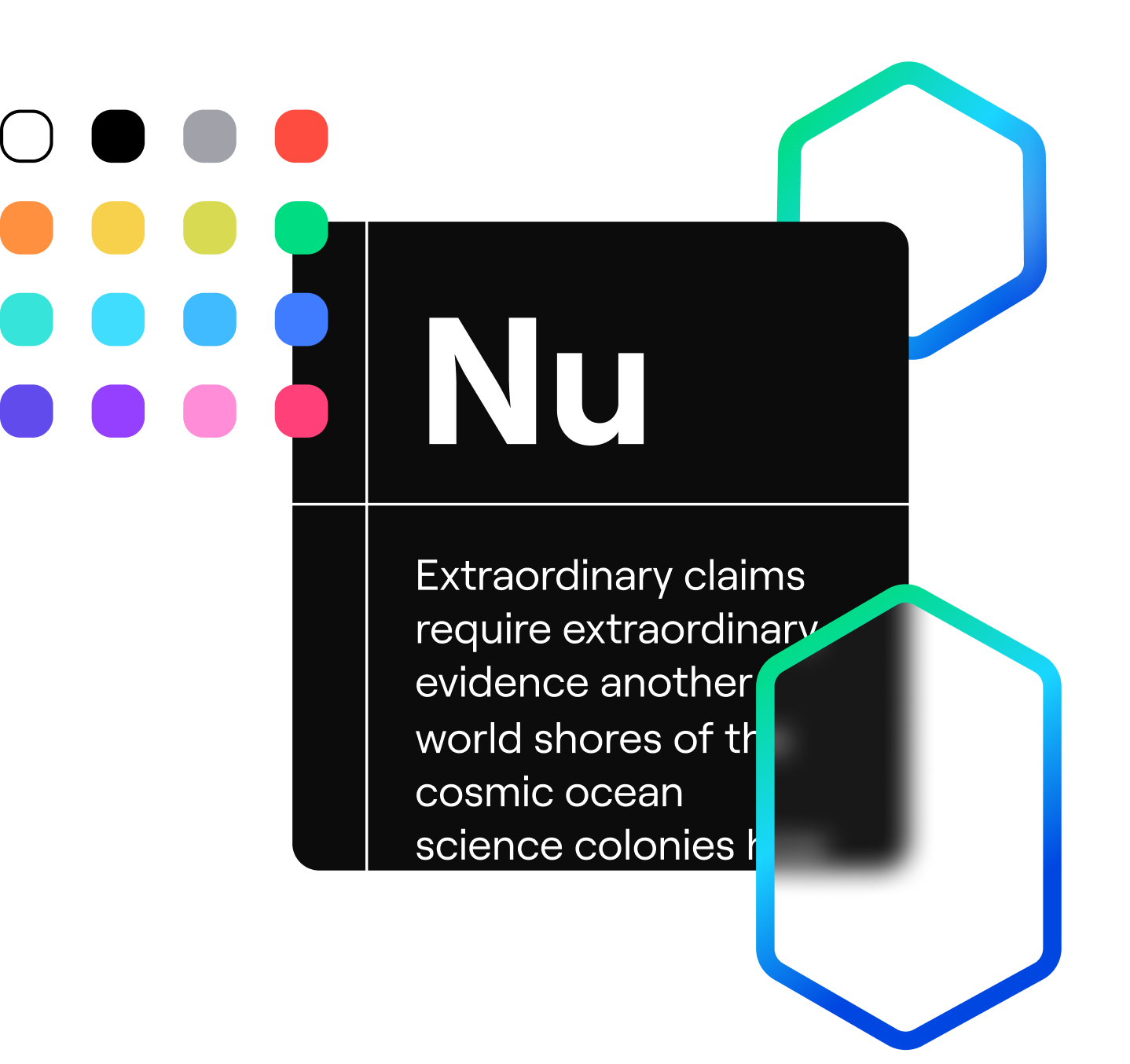
Gradient “Aurora”
#00DC82 to #36E4DA then #0047E1
White
#FFFFFF
Gray
#0C0C0D
Colors
The Primaries
Based on our iconic NuxtJS green, our primary colors represents the past the present and the future of the Nuxt brand. Adding more colors grant us more possibilities for emphasing content. We choose to go in direction of the blue because it reminds VueJS where it all started and fits far better with Nuxt DNA than warm colors.
Green
#00DC82
Teal
#36E4DA
Indigo
#407CFF
Colors
The Gradient
This gradient is here to represent the brand, across all supports (landings, apps, socials medias, videos). It’s designed to represent evolution of NuxtJS to a bigger solution including more products. It also keeps a bit of contact with nature identity, evocating an aurora which provide a feeling of dream.
- #00DC82#36E4DA#0047E1Gradient structure
Colors
The Secondaries
Our secondary palette contains a variety of colors with all the same base hue (the one of our iconic NuxtJS green) to keep consistency. We lean these colors more on the current & future Nuxt products to define their identity. By doing so, brand awareness & identity should be recognisable by every user.
- #71717A
- #FF4C40
- #FF9040
- #F7D14C
- #D8DA52
- #40DDFF
- #40BBFF
- #614BEC
- #9640FF
- #FF8DD8
- #FF4079
Logo
Monograms
Our logo honours the high mountains of the Pyrenees, the place where it all started. The shape is drawn with a smooth but structured path, that locks itself like an infinity symbol.
This is one of our most powerful tools to communicate our story and the values behind our brand.
Typography
Roobert font
Our brand typeface is Roobert PRO by the Display Foundry. This typeface was chosen for it’s aesthetic reminding the shape of Nuxt logo by many aspects (joints, apex, vertex of the structure). It provides modernity and sobriety while giving an iconic aspect of our visual content and without decreasing the accessibility of texts.
Font is also variable which allows us to fit with any contexts.
The quick brown fox jumps over the lazy dog.
Typography
Usage
For Nuxt brand, we will only use Regular / Medium / Semibold / Bold weights 99% of the time. You should avoid Light & Heavy if you want to use it as Nuxt Identity. Only exceptions are for super, subscript characters, also you can use heavy if you go upper than 72px for a font size. As Roobert font is licensed, you cannot use it for free so you can use the Inter font as an alternative. If you want to have visuals with Roobert official font, contact us we will give you the asset ready.
Want to know more about identity ?
Read our article explaining the past changes, design decisions & what is our mindset.